Data Engineering in Microsoft Fabric

Data Engineering in Microsoft Fabric

Microsoft Fabric, also known as Azure Data Factory, is a cloud-based data integration service that allows you to create, schedule, and manage data pipelines. As a part of data engineering in Microsoft Fabric, you can perform various tasks related to data ingestion, transformation, and movement.

  • • Create and manage your data using a Lakehouse
  • • Design pipelines to copy data into your Lakehouse
  • • Use Spark job definitions to submit batch/streaming job to Spark cluster
  • Use notebooks to write code for data ingestion, preparation, and transformation

Key Components and Features:

  1. Data Movement: Using Azure Data Factory, you can move data seamlessly and efficiently from various on-premises and cloud data sources to Azure. This includes support for relational databases, non-relational data stores, file systems, and more.
  2. Data Transformation: The platform provides the capability to transform raw data into a usable format for analysis and reporting. This involves data mapping, cleansing, aggregation, and other transformation processes.
  3. Data Orchestration: With Azure Data Factory, you can orchestrate and coordinate data workflows, ensuring that data is processed in the right order and at the right time.
  4. Integration with Other Azure Services: Microsoft Fabric integrates with other Azure services such as Azure Synapse Analytics, Azure Databricks, and Azure HDInsight, allowing you to leverage additional capabilities for advanced analytics and machine learning.
  5. Monitoring and Management: The platform offers monitoring and management features to track the performance and health of data pipelines, as well as the ability to troubleshoot issues as they arise.

Advantages of Using Microsoft Fabric for Data Engineering:

  • Scalability: Azure Data Factory can handle large-scale data engineering tasks, making it suitable for enterprises with diverse and voluminous data requirements.
  • Integration: Seamless integration with other Azure services provides a comprehensive environment for end-to-end data engineering and analytics.
  • Hybrid Capabilities: Fabric supports hybrid data integration, enabling organizations to work with both on-premises and cloud-based data sources.
  • Security and Compliance: The platform offers robust security measures and compliance certifications, ensuring that sensitive data is handled in a secure and compliant manner.

In conclusion, data engineering in Microsoft Fabric (Azure Data Factory) empowers organizations to build, deploy, and manage data pipelines for diverse data integration and transformation needs, leveraging the capabilities of the Azure cloud platform to drive valuable insights and innovation.

Case Study: Retail Sales with Data Engineering

Company Background: XYZ Retail is a multinational retail chain with stores across the globe. They sell a wide range of products, including electronics, clothing, groceries, and more. XYZ Retail wants to leverage data engineering to gain insights into their sales, customer behavior, inventory management, and supply chain operations.

Objective: The objective is to build a comprehensive analytics platform using Azure Synapse Analytics to analyze sales data, optimize inventory levels, improve customer experience, and enhance overall business performance.

Solution:

  1. Data Ingestion:
    • Utilizing Azure Data Factory, XYZ Retail sets up data pipelines to ingest sales data from various sources, including POS systems in stores, online transactions, and external vendors.
    • Data from different sources is standardized, cleansed, and stored in Azure Blob Storage and Azure SQL Database for further processing.
  2. Data Transformation:
    • Azure Synapse Analytics is used to transform raw sales data into actionable insights. Spark pools are leveraged for processing large volumes of data in parallel.
    • Data engineers write Spark jobs and SQL queries to perform data cleansing, aggregation, and enrichment. For example, they aggregate sales data by product category, location, and time.
  3. Data Storage:
    • Azure Synapse Analytics provides a unified platform for storing both structured and unstructured data. XYZ Retail stores process sales data in a dedicated SQL Data Warehouse within Azure Synapse.
    • They also utilize Azure Data Lake Storage Gen2 for storing raw data, enabling data scientists to perform advanced analytics and machine learning.
  4. Data Analysis:
    • Data analysts and business users access the analytics platform through tools like Power BI and Azure Synapse Studio.
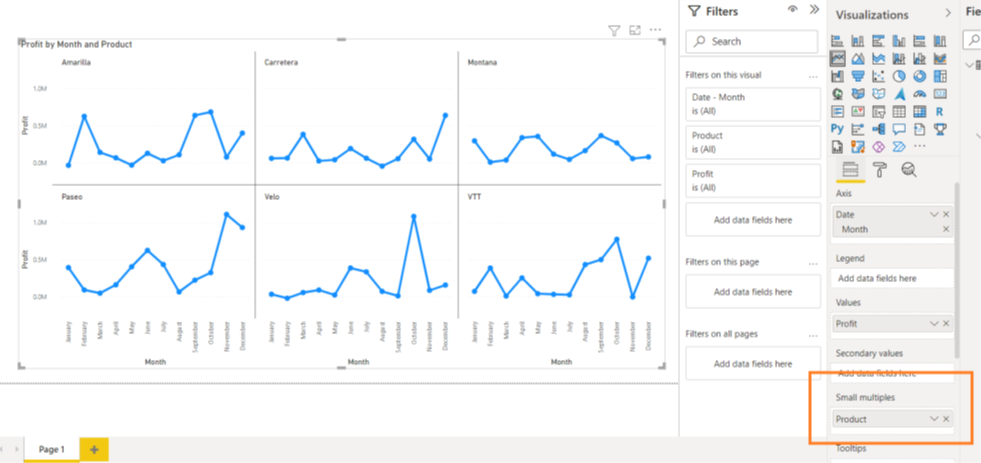
    • They create interactive dashboards and reports to visualize sales trends, customer demographics, product performance, and inventory levels.
    • Advanced analytics techniques, such as predictive modeling and forecasting, are applied to optimize inventory management and identify potential sales opportunities.
  5. Data Integration:
    • Integration with Azure Machine Learning enables XYZ Retail to build predictive models for demand forecasting, customer segmentation, and personalized recommendations.
    • Azure Synapse seamlessly integrates with Power BI for real-time analytics and reporting, empowering decision-makers with actionable insights.
  6. Security and Compliance:
    • XYZ Retail ensures data security and compliance with Azure Synapse’s built-in security features such as encryption, RBAC, and auditing.
    • They adhere to regulatory requirements such as GDPR and PCI-DSS to protect customer data and maintain trust.

Microsoft Fabric:

Enabling Microsoft Fabric 

Microsoft Fabric shares the same Power BI tenant. If you have a Power BI or Microsoft Fabric tenant already created: Enable fabric at the tenant level: If you have admin privileges, you can access the admin center from the Settings menu in the upper right corner of the Power BI service. From here, you can enable Fabric on the tenant settings page. When you enable Microsoft Fabric using the tenant setting, users can create Fabric items in that tenant. For that, navigate to the tenant settings page in the admin portal page of the tenant, expand the Users can create fabric items field, toggle the switch to enable or disable it, and then hit Apply.

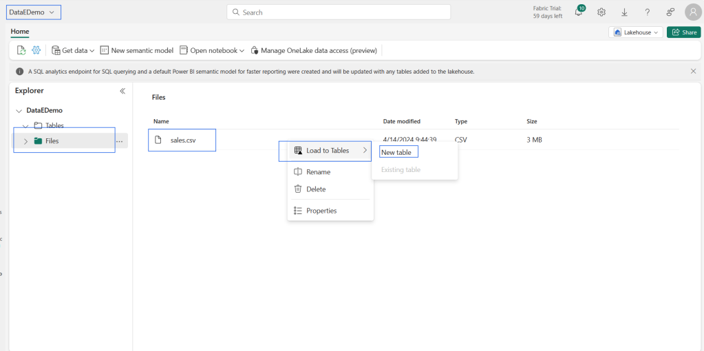
Create and explore a lake house

  • We create and configure a new lakehouse in the data engineering workload. Each lake house produces three named items in the fabric-enabled workspace:
  • Lakehouse is the lake house storage and metadata, where you interact with files, folders, and table data.
  • The semantic model (default) is an automatically created semantic model based on the tables in the lake house. Power BI reports can be built from the semantic model.
  • The SQL analytics endpoint is a read-only SQL analytics endpoint through which you can connect and query data with Transact-SQL.

Ingest data into a lake house

  • There are many ways to load data into a Fabric lake house:
  • Upload: Upload local files or folders to the lake house. You can then explore and process the file data and load the results into tables.
  • Dataflows (Gen2): Import and transform data from a range of sources using Power Query Online and load it directly into a table in the lake house.
  • Notebooks: Use notebooks in Fabric to ingest and transform data and load it into tables or files in the lake house.
  • Data Factory pipelines: Copy data and orchestrate data processing activities, loading the results into tables or files in the lake house.
  • Shortcuts are useful when you need to source data that’s in a different/external storage account or even a different cloud provider. Within your Lakehouse you can create shortcuts that point to different storage accounts and other Fabric items like data warehouses, KQL databases, and other Lake houses.

Working with Data Lakes and External Tools

  • Data sources: Fabric makes it quick and easy to connect to Azure Data Services, as well as other cloud-based platforms and on-premises data sources, for streamlined data ingestion.
  • Ingestion: You can quickly build insights for your organization using more than 200 native connectors. These connectors are integrated into the Fabric pipeline
  • drag-and-drop data transformation with dataflow..
  • Transform and store: Fabric standardizes on Delta Lake format. Which means all the Fabric engines can access and manipulate the same dataset stored in One Lake without duplicating data. This storage system provides the flexibility to build lake houses using a medallion architecture or a data mesh, depending on your organizational requirement.
  • Consume: Power BI can consume data from the Lakehouse for reporting and visualization
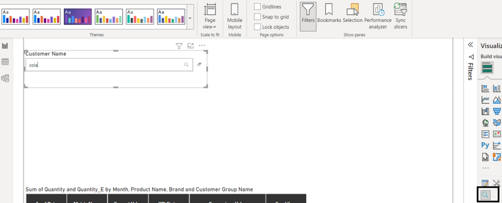
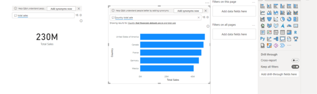
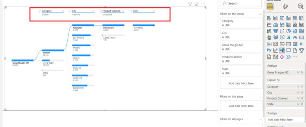
Demo

Conclusion

Microsoft Fabric is a powerful tool for data engineering, providing a comprehensive suite of services and capabilities for data collection, storage, processing, and analysis. Whether you’re looking to implement a Lakehouse or data warehouse architecture, or a combination of both, Fabric offers the flexibility and functionality to meet your data engineering needs.

Please share your valuable feedback!!
Thank you

DP-600 Certification

The DP-600 exam (Fabric Analytics Engineer) covers a broad range of skills and tools related to Microsoft Fabric. Think of components and concepts such as:

  • Data Lakehouse
  • Data warehouse
  • Data modeling
  • Data transformation
  • Notebooks
  • Dataflows Gen2
  • Semantic model

To prepare for this exam, you will find the information useful, and that will, in the end, help you master all the necessary skills to become a certified Fabric Analytics Engineer.

To implement solutions as a fabric analytics engineer, you partner with other roles, such as:

  • Solution architects
  • Data engineers
  • Data scientists
  • AI engineers
  • Database administrators
  • Power BI data analysts

In addition to in-depth work with the Fabric platform, you need experience with:

  • Data modeling
  • Data transformation
  • Git-based source control
  • Exploratory analytics
  • Languages, including Structured Query Language (SQL), Data Analysis Expressions (DAX), and PySpark

Weightage:

  • Plan, implement, and manage a solution for data analytics (10–15%)
  • Prepare and serve data (40–45%)
  • Implement and manage semantic models (20–25%)
  • Explore and analyze data (20–25%)
  • Plan, implement, and manage a solution for data analytics (10–15%)

Plan a data-analytics environment.
• Identify requirements for a solution, including components, features, performance, and capacity stock-keeping units (SKUs)
• Recommend settings in the Fabric admin portal
• Choose a data gateway type
• Create a custom Power BI report theme
Implement and manage a data analytics environment.
• Implement workspace and item-level access controls for Fabric items
• Implement data sharing for workspaces, warehouses, and lake houses
• Manage sensitivity labels in semantic models and lake houses
• Configure Fabric-enabled workspace settings
• Manage Fabric capacity
Manage the analytics development lifecycle.
• Implement version control for a workspace
• Create and manage a Power BI Desktop project (.pbip)
• Plan and implement deployment solutions
• Perform impact analysis of downstream dependencies from lake houses, data warehouses, dataflows, and semantic models
• Deploy and manage semantic models by using the XMLA endpoint
• Create and update reusable assets, including Power BI template (.pbit) files, Power BI data source (.pbids) files, and shared semantic models

Prepare and serve data (40–45%)
Create objects in a lake house or warehouse.
• Ingest data by using a data pipeline, dataflow, or notebook
• Create and manage shortcuts
• Implement file partitioning for analytics workloads in a lakehouse
• Create views, functions, and stored procedures
• Enrich data by adding new columns or tables
Copy data
• Choose an appropriate method for copying data from a Fabric data source to a lakehouse or warehouse
• Copy data by using a data pipeline, dataflow, or notebook
• Add stored procedures, notebooks, and dataflows to a data pipeline
• Schedule data pipelines
• Schedule dataflows and notebooks
Transform data
• Implement a data cleansing process
• Implement a star schema for a lakehouse or warehouse, including Type 1 and Type 2, slowly changing dimensions
• Implement bridge tables for a lakehouse or a warehouse
• Denormalize data
• Aggregate or de-aggregate data
• Merge or join data
• Identify and resolve duplicate data, missing data, or null values
• Convert data types by using SQL or PySpark
• Filter data
Optimize performance
• Identify and resolve data loading performance bottlenecks in dataflows
• Identify and resolve data loading performance bottlenecks in notebooks
• Identify and resolve data loading performance bottlenecks in SQL queries
• Implement performance improvements in dataflows, notebooks, and SQL queries
• Identify and resolve issues with Delta table file sizes
Implement and manage semantic models (20–25%)
Design and build semantic models
• Choose a storage mode, including Direct Lake
• Identify use cases for DAX Studio and Tabular Editor 2
• Implement a star schema for a semantic model
• Implement relationships, such as bridge tables and many-to-many relationships
• Write calculations that use DAX variables and functions, such as iterators, table filtering, windowing, and information functions
• Implement calculation groups
• Implement dynamic strings
• Implement field parameters
• Design and build a large format dataset
• Design and build composite models
• Aggregations in Power BI
• Implement and validate dynamic row-level security
• Implement and validate object-level security
Optimize enterprise-scale semantic models
• Implement performance improvements in queries and report visuals
• Improve DAX performance by using DAX Studio
• Optimize a semantic model by using Tabular Editor 2
• Implement incremental refresh
Explore and analyze data (20–25%)
Perform exploratory analytics
• Implement descriptive and diagnostic analytics
• Integrate prescriptive and predictive analytics into a visual or report
• Profile data
Query data by using SQL
• Query a Lakehouse in Fabric by using SQL queries or the visual query editor
• Query a warehouse in Fabric by using SQL queries or the visual query editor
• Connect to and query datasets by using the XMLA endpoint

All the best!!

Domains (preview)

Today, organizations are facing massive growth in data, and there’s an increasing need to be able to organize and manage that data in a logical way that facilitates more targeted and efficient use and governance.

organizations are shifting from traditional IT centric data architectures, where the data is governed and managed centrally, to more federated models organized according to business needs.

This federated data architecture is called data mesh.

A data mesh is a decentralized data architecture that organizes data by specific business domains, such as marketing, sales, human resources, etc.

Microsoft Fabric’s data mesh architecture primarily supports organizing data into domains and enabling data consumers to be able to filter and find content by domain.

Future releases will enable federated governance, which means that some of the governance currently controlled at the tenant level will move to domain-level control, enabling each business unit/department to define its own rules and restrictions according to its specific business needs

In Fabric, a domain is a way of logically grouping together all the data in an organization that is relevant to a particular area or field.

One of the most common uses for domains is to group data by business department, making it possible for departments to manage their data according to their specific regulations, restrictions, and needs.

To group data into domains, workspaces are associated with domains.

When a workspace is associated with a domain, all the items in the workspace are also associated with the domain, and they receive a domain attribute as part of their metadata.

During the Fabric public preview, the association of workspaces and the items included within them with domains primarily enables a better consumption experience.

For instance, in the One Lake data hub, users can filter content by domain in order find content that is relevant to them.

•Going forward, capabilities for managing and governing data at the domain level will be added.

Domain image

To create a domain:

To unassign a workspace in the Workspaces in this domain section, hover over the workspace entry and select the unassign icon that appears.

Custom Visuals in Power BI

There is a lot of custom visualizations that you can use to make a report. Power BI offers a good set of in-built visuals such as 

1.line chart

2.bar chart

3.funnel chart

4.KPI

5.map

6.pie chart

7.donut chart, etc.

You can access and use these pre-packaged visuals from the Visualization pane in Power BI Desktop.

Power BI offers a rich library of custom visuals from which you can select, import to Power BI Desktop and use as per business requirement.

Power BI offers a rich library of custom visuals from which you can select, import to Power BI Desktop and use as per requirement

Custom visuals are created by developers using the custom visuals SDK.

Developers use JavaScript libraries such as jQuery, D3, R-language scripts, etc. to create custom visuals from scratch.

Once a custom visual is ready, it is then tested and debugged.

After it is ready and secure, a developer packages it in the .pbiviz file and share it within an organization or upload it on AppSource as an open-source data visualization.

From the AppSource, any Power BI user (author) can import the custom visual to use it in their report.

Power BI custom visuals are divided into below categories:

•Custom All visual files

•Organizational visuals

•Appsource visuals

Organizational Visuals

The custom visual files are the .pbiviz files that contain codes to run custom visual in your Power BI app. Developers create custom visual codes and package them in custom visual files having .pbiviz extension. The customers or report makers download these files into their system and use them in their Power BI reports.

However, there is one important thing to note, you must make sure that the custom visual you are importing is from a trusted source or power bi certified visuals.

The custom visual should be free from any kind of security and privacy risk.

Organizational visuals are the visualizations, custom-made for use within an organization.

The Power BI admin (administrator) takes care of the deployment and management of the custom organizational visuals. The admin uploads selected custom visuals from the Power BI Admin Portal to the organizational visual’s repository. Users or report authors take these custom visuals into Power BI Desktop for their use

AppSource Visuals

Marketplace visuals are tested and approved custom visuals from Microsoft and its fellow community members. Such custom visuals are developed and uploaded on AppSource. 

Microsoft subjects some selected visuals to even more rigorous quality and risk testing.

The visuals that pass such testing are called certified visuals. These visuals provide some additional functionality as well, such as email subscriptions, export to PowerPoint, etc.

Business Apps – Microsoft AppSource

Step 1: Go to the Microsoft AppSource website. The AppSource home page will open.

Select the Apps tab from the bar on the top.

Step 2: Select Power BI Visuals options.

Step 3: The page will show more than 200 results of Power BI visuals. You can browse the list of available custom visuals.

Step 4: Let’s say, we want to use the KPI Matrix in our Power BI report. You can select what you require by reading the descriptions of each visual. Click on Get it now.

Step 5: Click on Continue in the next window.

Importing Custom Visuals from File

The custom visuals that you’ll download from AppSource will get downloaded in your system at a default location. We will get those custom visuals in Power BI Desktop through Import from file option.

To do this, follow these steps.

Step 1: Open Power BI Desktop in your system. From the Visualizations pane, click on the ellipses … icon. Then, select Import from file option.

Step 2: Select the .pbiviz custom visual file from the

destination. Then click on Open

Step 3: A message prompt indicating successful import of file will appear on Power BI Desktop.

Step 4: As shown in the screenshot below, the Power KPI Matrix graph that we imported is shown in Visualizations pane and is ready to be used.

Importing custom visuals from Get more visuals

To import custom visuals available on the more visuals, follow the steps given here.

Step 1: Click on the ellipsis’s icon … in the Visualizations pane. Select Import from Get more visuals option.

Step 2: The Power BI visuals dialog box will open. You will find tabs at the top; All visuals, My Organization and Appsource Visuals. Click on all visuals. You will see a list of all the available custom visuals. Also, you can select a category and then browse for the custom visuals. You can also directly type the name of a visual or category that you are looking for in the search area.

Step 3: Select a custom visual from the list and click on Add. The visual will be added in your Power BI Desktop’s Visualizations pane. For instance, we have selected the Text filter custom visual from the AppSource

.

Importing Organizational Custom Visuals

Just like we saw how to import custom visuals from the AppSource, we have power bi admin part  organizational custom visuals.

To import custom visuals available in your organization’s repository, follow the steps given here.

Summary:

This concludes our blog on custom visuals in Power BI.

Please like share and let me know if any questions on the same by writing comments below.

AI visuals in Power BI

Objective:

1.How to use Q&A Visuals

2.Key Influencer

3.smart narrative

4.How to use decomposition Tree visual to break down a measure

Objective of AI Visuals:

The fastest way to get an answer is to ask a question by using our own words. Power BI allows you to do exactly that method with its advanced AI capabilities.

One feature of Power BI is that it allows you to ask questions by using natural language, and then it will answer those questions for you.

Similarly, your dataset is likely numerical, where it consists of numbers, amounts, measures, and so on.

You’ve been successfully analyzing this numerical data to get insights. Analyzing non-numerical data can be difficult, but with the AI capabilities of Power BI, you can analyze text data to get more insights than before.

Now, you can analyze this data and transform it into valuable information.

Q&A visual

This ability to ask questions is valuable to you, It gives you ideas for the type of visuals that you can display in your report and lets you quickly add those visuals.

It gives your report users an effective tool that they can use to get quick answers to their questions about the data, independently.

To get access Q&A feature, you need to add the Q&A visual to your report. You can double-click anywhere on the report canvas, and the visual should appear. Alternatively, you can also select the Q&A icon on the Visualizations pane.

When the Q&A visual or button is added to your report, you can reposition and resize it. You can also customize the formatting in the same way that you would for any other type of visual or button.

You can start asking questions immediately by selecting one of the suggested questions or by entering a question into the question box. As you type, Power BI will automatically display suggestions to help you complete your question.

Q&A setup. Then, select the Teach Q&A option.

To turn a Q&A result into a standard visual, select the icon next to the question box.

The Q&A feature is unique in that it does not require users to have knowledge of Power BI to use the visual; users can ask their questions and they, too, can create insightful visuals.

How to use Key influencers visual

Key influencers visual helps you understand the factors that drive a metric you’re interested in. It analyzes your data, ranks the factors that matter, and displays them as key influencers.

We can see the factors affect the metric being analyzed

Long term contracts

Under Build visual on the Visualizations pane, select the Key influencers icon

Move the metric you want to investigate into the Analyze field. To see what drives a customer rating of the service to be low, select Customer Table > Rating

Move fields that you think might influence Rating into the Explain by field. You can move as many fields as you want. In this case, start with:

2.Country-Region

3.Role in Org

4.Subscription Type

5.Company Size

6.Theme

Leave the Expand by field empty. This field is only used when analyzing a measure or summarized field.

Smart narrative:

smart narrative visualization helps you quickly summarize visuals and reports. It provides relevant innovative insights that you can customize.

The smart narrative summary is highly customizable. You can edit or add to the existing text by using the text box commands. For example, you can make the text bold or change its color.

Dynamic values. You can map text to existing fields and measures or use natural language to define a new measure to map to text. For example, to add information about the number of returned items in the sample file, add a value.

Decomposition tree visuals:

The decomposition tree visual in Power BI lets you visualize data across multiple dimensions.

It automatically aggregates data and enables drilling down into your dimensions in any order.

It’s also an artificial intelligence (AI) visualization, so you can ask it to find the next dimension to drill down into based on certain criteria.

This tool is valuable for ad hoc exploration and conducting root cause analysis.

Analyze – the metric you would like to analyze. It must be a measure or an aggregate.

Explain By – one or more dimensions you would like to drill down into.

Data Split AI:

These splits appear at the top of the list and are marked with a light bulb. The splits are there to help you find high and low values in the data, automatically.

The analysis can work in two ways depending on your preferences. Using the supply chain sample again, the default behavior is as follows:

High Value: Considers all available fields and determines which one to drill into to get the highest value of the measure being analyzed.

Low Value: Considers all available fields and determines which one to drill into to get the lowest value of the measure being analyzed.

If you select a different node in the tree, the AI Splits recalculate from scratch.

In the example below, we changed the selected node in the Forecast Bias level. The subsequent levels change to yield the correct high and low values.

Fields Parameter in Power BI?

Fields Parameter feature is one of the newest features for Power BI as per monthly release May 2022.

What is Fields Parameter?
Previously we had to use lots of bookmarks to create dynamically changing visuals? But now with the help of Fields Parameter is we can achieve that kind of requirements very quickly.

What does it do?

Fields Parameter helps to perform the dynamically change the measures/dimensions that are being used to create visuals within a report.

It enables you to choose from different fields. You can easily toggle between different fields that you add to this parameter to see various results.

In order to create a field parameter, you will need to first enable the Preview feature called ‘Field parameters’:

Then, to create a new field parameter, you will need to navigate to Modeling -> New parameter -> Fields:

To build the parameter, you will need to provide a name for the parameter and select the fields you want to use.  In this example for a field parameter, we’ve selected different dimensions:

In this dialog, we may drag and drop to change the ordering of the fields or double click on any of the selected fields to change the display name. 

 You may also mix and match different measures and dimensions within the same parameter. 

 For example, this feature can be used to create a dynamic table, whereby the columns may be either measures or dimensions.

Once you’ve created a field parameter, you can now use the parameter to control the measures or dimensions used in a visual.

You may use the parameter in the field drop zones for a visual. 

Note that certain visual properties have restrictions on the number of fields that may be used or the types of fields that can be used.

From within the context menu, you can also change whether the field parameter is showing the values of the selected field(s) or the display names of the selected field(s) for all non-slicer visuals, viz.

Finally, if you need to edit any existing field parameters, you will need to modify the DAX directly.  For example, if you want to add a new field to an existing parameter you can click SHIFT + ENTER to start a new entry:

You’ll need to add a comma between each entry, and you will need to match the following format:

In previous snapshot on formulae editor

(“<display name of choice>”, NAMEOF(‘<table name>’[<field name>]), <ordinal number used for sorting>)

Limitations:

• AI visuals and Q&A are not supported with the feature

•There is no way for end users to select ‘none’ or no fields option. 

•This is because selecting no fields in the slicer or filter card is the same as selecting all the fields

•you cannot use implicit measures for now, meaning if you need an aggregated column as one of your fields, then you would need to create an explicit DAX measure for it

•example of implicit measure: ∑ Sales

•example of explicit measure: Measure = SUM(‘Table’[Sales]).

Thank you for the read. Please share if any comments

How small Multiple works in Power BI

Small multiple charts are a set of charts of the same type on a grid, allowing you to easily compare values over the different other charts.

 I’ve imported financial sample dataset. Suppose I want to plot the Profit of the Date month over time with Product category field at small multiple. We are going to get the below chart from Jan-to dec.

In the above chart we have many datapoints in one graph it has become an clumsy which is not understandable my customer. Small multiples to the rescue! In this scenario In the visualization’s menu, drag the subcategory name from the legend to the small multiples box:

There’s one problem though: there are 6 sub-categories and the chart shows 3×2. Which means you have to use the scrollbar to see the last two. This is something you’d want to avoid on a dashboard. Luckily we can adjust this. With the chart selected, go to the format pane and change the grid layout to either 3 rows or 2 columns.

Now everything fits on one page: with 2 rows and 3 columns we can set in single chart

I like how Power BI doesn’t unnecessarily repeat axis for every chart, but rather displays them only on the left on the bottom of chart. Also, all charts have the same scale (0 to 30 in our example), which means it still makes sense to compare the different graphs with each other.

Thank you

Please share your feedback and comments

Thanks

Rajendra

How Error Bars works in Power BI?

What is Error Bars?
Error bars are graphical way to visualize the uncertainty of data .
They give a general idea of how precise a measurement is, or conversely, how far from the reported value the true (error free) value.
Error bars helps to Identify estimated error or uncertainty to give a general sense of how measures is precise with data points.

Interpretation of Error bars in Power BI Visuals?

We can add error bars to line charts to visualize the uncertainty in the data!

Uncertainty is one of the important aspect to data, where the displayed value of a point needs to be is shown with the range of its possible values.

With this new feature, we can specify upper and lower bounds to the values in line chart and customize the way the uncertainty of data in visualized in chart.

In Power BI we need to enable this feature which is a preview feature of March 2022 and make sure  we must go to File > Options > Preview features and making sure the error bars checkbox is checked. 

Also, please make sure we must enable ‘New format pane” feature as “Error bars” functionality is available for the New format pane only. Then we can create a line chart and add a measure for which you have upper and lower bound fields to display.

Line chart

Below I am visualizing a line chart with over time (date) with  profit metric and taken the segment as legend with two categories.

Where to configure Error Bars in Power BI?

In the Analytics pane, we will see a new Error bars card.

At the top, we’ll see a dropdown to select the measure to which we would like to add error bars.

Beneath it, we’ll find options to enable error bars for this measure, add upper and lower bound fields, and indicate how the upper and lower bounds relate to the measure. 

Absolute means that the fields contain the exact value of the upper or lower bound, while Relative means that the fields contain the difference between the upper or lower bound and the measure.

For example, if at one point my measure has a value of 60, an upper bound of 90, and a lower bound of 45, my upper bound field in absolute terms would be 90 and my lower bound 45, while my upper bound in relative terms would be 30 while my lower bound would be -15. Choose the option which suits the format of your upper and lower bound fields.

Confidence interval with Error Bars

By default, these intervals will be represented by a vertical line with horizontal caps on either end.

With Upper bound and Lower bound value, the data is showcasing the data uncertainty of each of the element for profit values.

Hovering over a point will show the values of the nearby error bars in a tooltip: with Upper and Lower interval.

Please share your feedback and comments in below.

Thank you!!

#Powerbi #errorbars #Powerbidesktop #PowerBIerrorbars

Create a What-if Parameter in Power BI? 

In any data analysis project, whenever we analyze data, always want to find out, some what-if scenarios. For example, what if sales increased by 10% or what if we decreased item cost by 1%. 

These what-if analyses can be very helpful for any decision-making process. 

Power BI has an AI-driven feature that enables us to implement these what-if scenarios. This is known as What-If Parameters

Here , we are going to explore this functionality with examples.

Get Data

For this scenario, I consider the sales dataset and the file location available in below path.

Let’s start with the Get Data option under the Home tab. Extract data from  Excel workbook option from the quick connections.

•Select the file named US Superstore data.xlsx

•After selecting the file,

•data will be displayed in the below format

•Click on Load and save data.

Where to find What-if Parameter tab?

By default

It is having below parameters inside

What-if Parameters:

Name of the what-if parameter

Data type (Whole number (Default), Decimal number, Fixed decimal number)

Minimum

Maximum

Increment

Default: a value used for the what-if parameter when no value is selected in the slicer.

Add slicer to this page default selection

Create Discount/Markup What if Parameter

1.Create one What if parameter and provide the below information.

2.Name -> “Discount Range”, Data type → Decimal number, Minimum → 0, Maximum -> 1, Increment -> 0.01

3.click the check box for “Add slicer to this page”.

4. Click on the “OK” button and two things will be added.

i) Created “Discount/Markup” table

ii) Added one slicer in the page as Discount/Markup.

What -if parameter created, but you don’t know how you can use this in your project. 

Let us find the application of this parameter. 

1.Create one calculated measure to use this above parameter in your project.

2.Create the below measure under the “US Superstore data” table.
Updated Sales =

‘Discount/Markup'[Discount/Markup Value] * SUM(Orders[Sales])

I have taken Waterfall Chart under Visualization pane.

4. Add Order Date Hierarchy in the Category section. Keep the only Year and Month.

5. Add Category field in the Breakdown section.

6. Add Revised Sales in Values.

Choose the above fields.

Enable the data label and increase the font size and units I am displaying with None. So that the end user can see full value. from the single slicer we can Use the Discount/Markup slicer to try different values and observe the changes in the chart. 

Save this report with What If parameter analysis .pbix format.

Please share your comments if any